In this week’s session we meet New Jersey artist Chris Forrest and talk about his work, about resume building, signatures, pricing and more.
You can view the schedule for upcoming sessions and participate in our Critique Group by visiting our Online Critique Page.

|
|
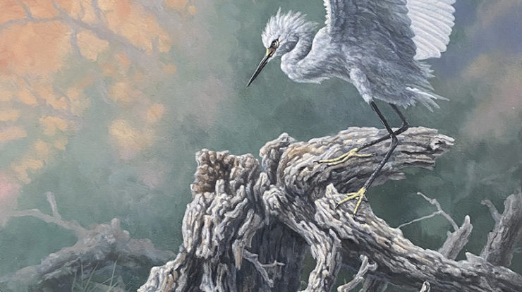
| Artwork Information: | Title: It’s MY Stump Medium: Oil Size: 20×16” Price: 1750 |

|
|
| Artwork Information: | Title: Winter Visitors Medium: Oil Size: 14×24” Price: 1950 |

|
|
| Artwork Information | Title: Hazy Morning Hangout Medium: Oil Size: 16×20” Price: 1750 |

|
|
| Title | Title: Low Country Swans Medium: Oil Size: 16×12” Price: 1250 |

|
|
| Artwork Information: | Title: Fancy Flying Medium: Oil Size: 11×24” Price: 1550 |
| Presentation Image #1 | 
|
| Presentation Image #2 | 
|
| Presentation Image #3 | 
|
| Portrait Image of Yourself | 
|
| What Questions Would you Like to Have Answered About Your Art During a Review Session? | Your strategy thoughts & advice: I’m attempting multiple paths, learn to paint again in a new environment-coastal, create a body of work, test the waters with national competitions i.e. OPA, NOAPS etc, ( lots of humbling declines but a couple of encouraging hits)come up to speed enough market wise/social media to be credible, work on fleshing out my new web site, this is a pretty gallery sparse area and at some point I need to work on gallery exposure somewhere . As I’m writing this todo list allow me to emphasize I’m having fun and really enjoying challenges (most of the time). And remind myself I’m the new kid in a lot of this. |
| What is Your Website Address (Optional) | chrisforrestart.com |
Regarding signatures, I place it on either lower left or lower right. Sometimes the signature can be too distracting if placed too close to an important element.
Hi Chris, I think your work (and signature) are fine! It’s just a matter of finding the right audience. Which I’m sure that you will.
I have a couple of thoughts on your website. I don’t know if you’ve gotten to the part in the art academy where Jason talks about websites and statements and resumes, etc… but his info on all that really helped me. I like to keep the menu as minimal as I can so I might put ‘current works’ ‘sold and archived paintings’ ‘archive lithographs’ in a sub-menu under ‘Artworks.’ And I might make the about page into 3 separate pages – bio, resume, statement and add more pictures to each.
Good luck! You have a great start with beautiful art!
Hi Chris,
I am in awe of your work- WOW! The subjects and color pallets are phenomenal. Especially the lithographs you have on your website, which is rare to find nowadays. Sort of similar to film photography, it’s another fabulous medium that is few and far between. You certainly have talent and I also think your signature is beautiful. Unlike me, you’re one of those artists who can sign with paint! LOL. On a serious note, I believe you just need to find great marketing tools to get you out in the open. Period. Creating a Facebook page and Twitter account specifically for your art posts are really great for mature audiences. Most of all, Jason’s ABA has helped me immensely and I believe the business knowledge is priceless and will boost your sales too.
Love the first painting and title, by the way… “That’s MY Stump!” Being a bird nerd myself, I know how dominant they can be. It’s also a fun way to get a feel of your sense of humor.
Best Wishes and keep PAINTING!