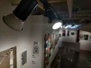
While I try not to let it go to my head, we frequently receive compliments about the display of artwork in the gallery. Positive comments about the display are gratifying because I put a lot of effort into making sure the gallery looks its best at all times. Having spent over twenty years in the gallery business, I have come to believe that the careful display of artwork is a critical to generating sales.
This is only logical – we are all in the business of helping people see art in it’s best light (both literally and figuratively). A viewer’s ability to experience new art in an inviting setting will have a huge impact on that viewer’s interest in purchasing the piece. It is also important to remember that we are asking a high price for the artwork we are selling. The venue where the work is shown should be commensurate with the suggested value of the work.
Let’s explore some of the considerations I make when displaying artwork. While I am approaching this from the perspective of a gallery owner, many of the principles will apply to an artist showing at an art festival or hosting an open studio tour.
Space
One of the most important factors to displaying art well is space. When displaying artwork I have found that it is important to give artwork room to breathe. It is also important to give the viewer room to step back.

Often, I encounter a tension between the desire to give art space and the desire to show as much work as possible. This tension is understandable; after all, one of the most valuable commodities I have in the gallery is space. Retail gallery space is expensive, and every square inch of wall and floor space is valuable. It is natural to feel that the wider the range of work we show, the more likely you are to be showing something that will catch an art buyer’s fancy. It’s not hard, therefore, to understand why some galleries and artists will fill walls from floor to ceiling with art.
The problem with the “pack it in” approach is that it becomes difficult for the viewer to focus on any one particular piece. A packed wall becomes a patchwork quilt of color and texture, and it can be very difficult for the potential buyer to distinguish individual details and see a work for it’s own merits.
The density of art in my gallery waxes and wanes a bit, depending on our current show or focus, but I always strive to give art the space it deserves. I would rather display less art and sell more, than display more art and sell less.
To give the work space, I typically hang artwork so that the center of the artwork is at 60″ from the floor – close to the average eye level. Whenever possible I separate artwork by at least 6-8″, and a minimum of 4″, though I may go a little less for a grouping of smaller pieces.
I also try and allow a minimum of 5 feet of space in front of a piece of artwork where a viewer can step up to examine the detail, and then step back to see the work from some distance. I give even more space for large or important works.

Which brings me to an important rule: if you want to emphasize a piece and add to it’s perceived importance (and value), give the piece space.
These same rules apply to three-dimensional art in the gallery. Sculpture shouldn’t be crowded into a corner or packed in front of other work. With sculpture, it’s important to keep the background in mind. Try not to place sculpture in front of a wall of busy art. Often, We will place a sculpture in front of a wall with no art on it so that the viewer can focus on the sculpture.
Flow

Another important consideration through the gallery is traffic flow. I work to create groupings of art that work well together and invite visitors to move naturally through the gallery. Our gallery isn’t huge – the display space is just over 2000 square feet – but the space is L shaped, and I want to have the visitor pulled through the whole gallery. Groupings of work are a good way to accomplish this. A grouping of similar artwork can serve as a kind of narrative, drawing the viewer from one piece to the next. I try to group all of an artist’s work together whenever possible, and, further, if the artist has several different subjects, I create groupings of that work.
If you are participating in a show, you should consider the narrative flow of your display space. By grouping works of similar subjects or colors, you can create a narrative flow. I know several artists who begin thinking about the flow of a show before they even begin creating the artwork.
Lighting
The final critical element in display is lighting. Seeing a piece of art with the right lighting can make the difference between making a sale and not. One of the gravest errors in the art business is lighting a piece inadequately. Too little light and the piece will fall flat – too much and it will become washed out.
Some galleries attempt to block out all natural light by building display walls in front of windows so that they may have complete control over the manner in which work is lit. I can see the advantage of this approach, but I also see disadvantages to blocking out exterior light. The biggest problem with blocking out natural light is that you also end up blocking the view into your gallery or display space. I like the idea of a late-night window-shopper being able to see back into the gallery, or a collector out and about on our artwalk being able to see how packed the gallery is with patrons. I also want viewers to see artwork in a similar light to the light in her own home. Most homes rely primarily on sunlight during the day for illumination.
 Our lighting is a combination of natural and artificial light. When I was working to design our gallery space in late 2006 (as we were moving into our current location after having been in a previous location for 5 years) I wanted a flexible display space. We left the gallery open and built moveable walls that allow us to modify the space when needed. This meant that we needed to have a flexible lighting system as well. We ended up deploying a low-voltage, MR-16 halogen cable track system, supplemented by clip cans with IR lights that can be easily moved. This system worked well for us because the art we carry and the gallery space are toward the contemporary end of the spectrum.
 Several years ago, we remodeled the interior of the gallery and I eliminated the moveable walls. This allowed me to replace the 10 year-old halogen system and finally make the switch over to LED lighting. LED technology has advanced a lot, and you now get better light with less heat and lower energy usage with LEDs. I use Philips par 30L, 25,000 hour dimmable bulbs. They rate 3000 K for color temperature, and give a warm, crisp light.
When lighting a piece of art, the goal is to create an even light across the surface. Avoid creating hot spots which occur when you have too much light concentrated in one area. Keep as much of the light as possible on the artwork and off the surrounding area. The contrast of the well-lit art and less-lit wall creates drama.
It’s also important to avoid creating glare. Glare is created when the angle of the light causes the reflection of the bulb to bounce back directly at the viewer. You control this by deciding on the optimal viewing distance for a piece of art, and then situating the light so that it is at an angle where the direct reflection will be directed outside the optimal viewing area.
What Do You Think?
How important do you feel the display of artwork is? What do you feel are the most important factors when displaying artwork? What have you seen galleries or artists do that has worked well? What have you seen them do that has not worked well? Please share your thoughts, ideas and experiences in the comments below.
Learn More About the Art Business
Be sure and join our mailing list to receive free art business advice from Xanadu Gallery in your inbox!
I feel the display of artwork is very important. You want to show your work in the best possible manner. More often than not, the commercial galleries I visit try to use as much wall space as possible by creating vertical rows of paintings. I find this makes it more difficult for the viewer to see the artwork’s full potential because it’s competing with the other work in close vicinity.
I love the space you give the artwork in your gallery Jason. It signals the importance of each piece in that it deserves the space it was given. Your gallery also looks clean, crisp and professional. I gravitate to the less is more concept of design.
I agree that how you display work is very important. When I first started to show, I was keen to accept any opportunity. Now I am fussy. I will only show paintings in places that have clean white walls and plenty of beautiful space. When displaying in my own studio, I like to group small paintings that work well together to encourage people to think of buying more than one artwork.
I’ve been wondering about the color temperature of studio lighting since I read in Richard Schmid’s Alla Prima that he used 5500K fluorescents in his studio, but the gallery I’ve shown in recently uses a temperature closer to what most homes do, the 3000K that you mention. What’s your advice for the light temperature in which to paint in the studio? Anyone here using 3000K in the studio? What’s your experience? For instance, a portrait of my wife is much warmer in the gallery, though it has its charms in the cooler light, too.
I have the same question.
Jason – you are right on with respect to this matter of effective art display! All great advice! I once produced a show (“RED”) in an abandoned furniture store. I had no more room left on the walls or in the windows to display a wonderful painting of a boxer (by Julie Snyder). I found an empty alcove that was empty of all art and put the painting on a small table in the middle of the space with the red walls behind it – enclosing the figure by himself. The lights happened to be configured perfectly to drop light right on the table. The minute people entered they saw him off to the side. I sold the piece in about ten minutes after the reception started! People were so drawn to that painting – all night people crowded around it. So you are right – less is more!
As always your keen insights and depth of knowledge are very apparent. Love your blog
Hello Jason, (and subscribers)
Great topic. I’m hoping we could delve into a sculpture-only display setting a bit further with respect to the plinths.
I work in stone, so the sculpture works get pretty heavy if I get larger than 24″ L x 10″ W x 6″ T. Typically the works end up in with the client sitting them directly on a flat surface (coffee table, side table, desk mantle, shelf), or on a metal stands I’ve custom-created that elevates the piece 6-10″ off said flat surface.
So my works differ enough in size, that I’m leaning to plinths of different sizes. Different sizes can also lead to storage solutions when the plinths are not in use, ala Russian stacking-dolls.
What plinth heights are best to aim for, and need they be the same height? My works tend to be of rectangular footprint, rather than square, so should my plinths also be rectangular (when viewed from overhead)? How much bigger should my plinth footprint be, compared to my sculpture footprint?
Should plinths be opaque in appearance, or does skeletal see-through construction work? If I have white background walls , should I also have white plinths? Drape white linen over each plinth?
GREAT TOPIC!!
Also on the subject of sculptures, mine are always all together in one vertical closed glass shelving system that is 18” x 18” with 4 shelves. So some of my work is actually on the ground. There may be as many as a dozen in there at a time, and I always hate the same feedback: collectors can’t make up their minds which one they like and so leave without making a purchase. However, when the gallery has displayed only one at a time on a proper plinth, they sell very quickly, so I have asked repeatedly for the work to be held back and put out alone, but every time I visit, they are all out again, and all in a crowd. I’ve also suggested they show the “extras” just to those collectors who would respond well to being singled out for the privilege or being the first to see new work. This is an ongoing frustration between me and the gallery, but I continue to supply them with everything I’ve got because it’s a long drive from home and several times now, collectors have bought 3 or more at a time. I am having a measure of success, so how can I keep harping about the awful displays I get?
Sounds as if you’re supplying the gallery with too many sculptures at once.. take some back!
Karl Moeller’s response corresponds to the advice of artist, Jack White. Jack has sold a lot of his work and that of his wife. His experience is that the magic number of art works a gallery should have is five to seven by a single artist at any one time. More than that, people feel visual over load. Less than that, they tend to feel they don’t have enough from which to choose.
With respect to lighting, I have run into a situation where the light bounced off my paintings with a hot spot from an angled spotlight type track light. This was because I had used a high gloss vanish. If I know I will not have control over the lighting where pieces will be displayed, I now use only a satin or matte varnish!
Great topic! So critical to selling work…Thank You for addressing this! So many times the sale of work depends on letting the work not be crowded and in the right light. Thanks Jason as always. Best, Darryl
I think this is one of your best and most useful posts, Jason. I found your discussion of lighting especially useful. Thank you.
When doing intl travelling exhibitions my greatest expense outside transport is proper lighting. without that done well your dead as typically theres one chance to make a sale. in a fixed location gallery there are often repeat visits to experience the work multiple times. Will often pass on a venue or exposition if the wall systems and show layouts are poorly placed.
I especially appreciate your addressing the spacing of art. They need to BREATHE.
Yes, I agree wholeheartedly…right on…less is more. I belong to one art group that puts the work up as it comes in and as many as will go on the wall/space! I have offered to help hang the works, as I am/was and Art Educator and frequently displayed my students works…so I know a bit about putting themes, colors. sizes up for optimum viewing.
Thank-you for keeping your fan club up to date, Jason.
Good article. I own a small art gallery and have to deal with the space vs room issue. Room to breathe, also makes a difference in how the viewer feels when in the gallery. Clutter does not give a sense of peace and enjoyment of the art. I feel like people come into a gallery for inspiration and for something to feed their soul, something to make them feel good, take a deep breath and just enjoy the moment. I think music adds to that also. I am still tweaking the lighting, and appreciate the advice on that.
5000, I believe, is closer to ‘natural sunlight’. I think it may be what musems use.
can we also agree that the walls should be white or neutral? and not grey cinder blocks?
Great Info! What would be your recommendation as to align or not the paintings on the upper edge? If we follow the idea of placing the center of the artworks at 60″ from the floor, that means the center of all artworks is at 60″ and we don’t consider the odd viewing this might give if pieces are of different sizes?
While I’ve seen other alignments, I’ve always preferred center alignment.

I have just opted out of a community gallery crammed to the gills with displays including paintings, crafts and assorted photos in a building shared with a rock collection. I moved to a place with no other galleries so left my abstract acrylic paintings there for several months on the mistaken premise that “it was better than nothing. ”
I was wrong about that.
Not only have I sold nothing amid the clutter, but, worse, I’ve been paying for the space while my work has dried up. The decision to leave has been a good one and I am back to work. I will find a better way show my work and it will sell as it did before I moved here.
This was a good reminder of the need to let the work and viewer breath! And Focus! This weekend we did an art event and there was the tension from another there to pack it out! I say a tension, because I feel the need even as the artist to focus on a single piece before viewing another. I love seeing your gallery in the background and appreciate how well you enabled each work to speak for itself. 🙂 Thank you
I feel that the most important gauge in gallery lighting is the CRI index (Color Rendering Index). Starting late in 2023 it is what I use for taking photographs of my art. The wide spectrum bulbs make an amazing difference in the photos to the point where I re-shot all my art. CRI over 90 (scale 0-100) will change the way you and potential customers see your art. Starting at $18.00 per bulb is high but if you have a home studio/gallery it is an upgrade you might consider.
Excellent advice and observations. Not only would I not exhibit in a gallery that appears ‘crammed to the top’ with a clutter of works, but I rarely even enter them, as it nearly give me a headache, rather than a relaxed, focused, experience. When I was doing outdoor art festivals, I also changed my display strategy, fighting the initial urge to ‘show all of my best work’ in the hopes that it would give more chances that something might capture a buyer’s eye. The mind is often overcome with too much choice, where it will bounce back and forth between a number of potentially interesting objects, but when unable to pick a clear favorite, the browser eventually give up in frustration and leaves without purchasing anything at all. Limiting the potential choices to a manageable amount is often a more successful strategy, and psychologically more comfortable for the potential buyer.
Thank you so much for this article. I have never been a fan of galleries with a “French Salon” hanging philosphy. As a newer gallerist, I’ve struggled with artists that bring far to much art for their “wall”. They want to cram as much of their work in the space that I have alotted them. I have learned to pushback on that approach, although I understand their position…showing as much work as they can. I would rather have 4-5 of their best pieces hung like a museum with plenty of space between them, than 15 paintings stacked on top of each other. After 2 years, I think I have found a balance with a well curated space. And the artists that, early on, I let cram in their art, it never sold until I thinned it out with only their best work.
What’s helped me with the artists, is that I allow them to display up to 10 more pieces of art on their artist page on our website that is not art they have hung in the gallery. That has appeased the majority of the “art crammers”. With our investment into digital marketing on more on-line sales, everyone (gallerist & artists) are lot more happy. Thanks again for writing this article. I know a few folks I’m going to forward it to.
Great insights on art display! I’ve always been curious about how the right spacing and setup affect viewer interest. Your focus on giving art space to breathe makes complete sense, as cluttered displays can indeed be overwhelming. Do you think the same principles apply to online galleries? Love to hear more thoughts on if there’s a digital equivalent to ensuring art shines online. Thanks for sharing your experience!