

One of the most important—and often overlooked—elements in preparing your work for galleries is presentation. A strong, cohesive presentation reinforces your professionalism and makes your work more appealing to both galleries and collectors. But it doesn’t have to break the bank.
Some artists assume gallery-ready means expensive custom framing or elaborate finishes, but that’s not the case. In fact, many of the artists in my gallery don’t frame their work at all. Instead, they use gallery-wrapped canvases with painted or finished edges, or cradled panels with clean sides. It’s a minimalist, professional look—and when done consistently, it works beautifully.
Why Galleries Group Work by Artist
Most galleries display an artist’s work together, often in clusters or on a dedicated wall. There’s a practical reason for this: grouping creates visual coherence and helps the viewer connect with the work.
When a collector walks into a gallery and sees several pieces by the same artist presented together, they begin to see the bigger picture—your voice, your themes, your range. It also makes it easier to compare works and increases the likelihood of multiple-piece sales.
But for that effect to work, the presentation has to be unified. If one piece is framed in dark wood, another in white metal, and the third is a bare-edged panel, the visual connection starts to break down.
Consistency Signals Professionalism
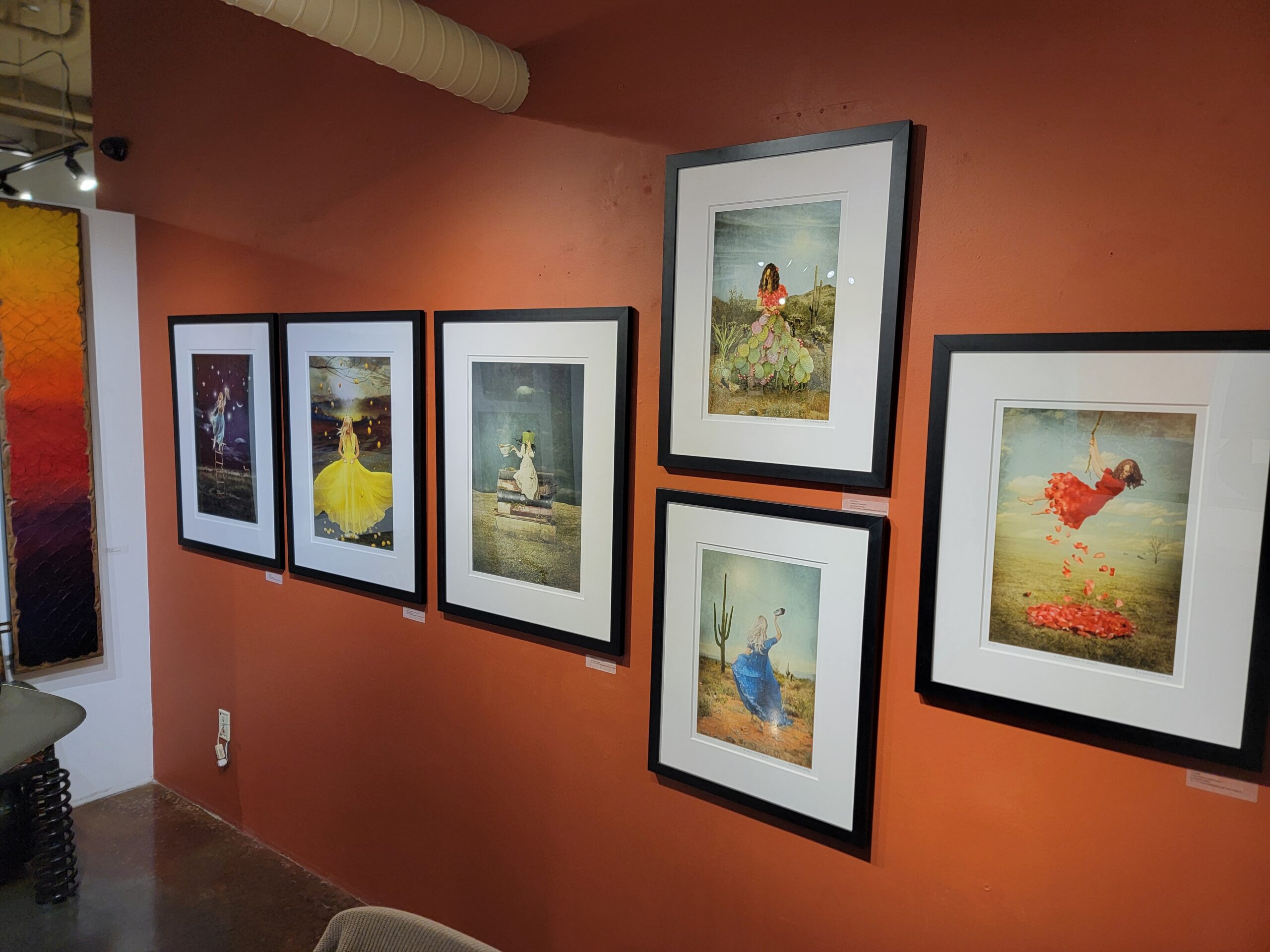
Whether you frame or not, consistency is key. When your presentation is unified—whether that means using the same profile and color frame, or sticking with gallery-wrapped canvases with finished edges—it tells a viewer: this is a professional body of work.
This principle holds true for sculptors and mixed-media artists as well. Your pedestals, bases, mounts, or hardware should feel cohesive from piece to piece. If your work includes installation components or display structures, those should reflect a clear design choice that supports the artwork without distracting from it.
Consistency doesn’t mean identical—it means intentional. Even with variation in size, medium, or subject matter, a coherent presentation creates trust and elevates the overall impression of your work.
Simple = Smart
You don’t need high-end framing or elaborate mounting solutions. In fact, simpler is often better:
-

My father (John Horejs) uses a simple gallery-wrap to create consistency in the presentaiton of his work. For paintings or 2D work: narrow black or white wood frames, floater frames, or well-finished gallery wraps all work well.
-
For works on paper: stick with white or off-white mats and simple frames that don’t compete with the art.
-
For sculpture: use uniform bases or pedestals in a consistent color or material that complement the work.
-
For mixed-media: define a presentation approach—whether floating mount, shadow box, or edge treatment—and stick with it.

Keeping things simple and consistent also saves you money. You can order in bulk, avoid surprises at the frame shop, and estimate your materials and shipping costs more accurately.
For more detailed framing strategies, I recommend reading this post on RedDotBlog:
https://reddotblog.com/mastering-the-art-of-framing/
Simplify to Save Time and Build Your Brand
Consistency isn’t just about appearance—it also simplifies your business operations.
-
One standard format means fewer supplier relationships to manage
-
You can create templated display, shipping, and pricing processes
-
You avoid last-minute scrambles or mismatched presentation at shows
-
Your collectors learn to recognize your work—and trust what they’re getting
And here’s the best part: when your presentation is clear and consistent, the focus stays on the artwork.
Final Thought: Build Consistency from the Start
If you’re just getting started, now is the perfect time to set presentation standards. And if you’re further along, it’s worth taking a moment to evaluate whether your current approach supports your goals—or complicates them.
Choose a presentation strategy—whether that’s a clean gallery wrap, a specific frame style, or a sculpture base—and commit. This small decision can create a big shift in how your work is perceived and how smoothly your art business runs.
Remember: consistency doesn’t limit creativity—it supports it. A thoughtful presentation allows your work to speak with clarity, confidence, and professionalism.
Very informative blog, Jason. Thank you for all you do to help artists. I’ve learned so much over the years from your blog.
I’m glad the blog has been a helpful resource for you, Cherie. I appreciate you following along and sharing that feedback—it’s encouraging to hear the posts are making a difference.
simplicity is best except when dealing with a specific client or known hanging locations. i once made the mistake of framing 20 pieces with dark heavy frames and liners because it was cheap and i did not have the funds. what a hassle. clients hated them and would not even take the frames home!.. ended up throwing out the lot and putting simple border frames on. with my work the clients invariably change out the frames anyway. when dealing with known specific clients i frame to suit as overall costs are minimal. generally i use italian handmade mouldings with subtle textural and color differences matched to the artwork. nothing overbearing.
Your experience is a good reminder that framing choices can have a big impact on sales—and on the bottom line. Richard, I like that you’ve found a balance between keeping things simple and tailoring to specific clients when it makes sense
I use simple black gallery frames and white mats with a black beveled edge. My work is contemporary and it works great. I’ve taught myself how to frame so I buy everything in bulk. My galleries know exactly how each work will look. I’m also consistent in the sizes I work in, which also cuts down on unnecessary costs. Thank you for these blogs, they really help put things in perspective.
Margaret, your approach is a perfect example of how consistency and efficiency can go hand-in-hand. Keeping framing and sizing uniform not only builds brand recognition but also helps manage costs—something every artist can appreciate.
I found your advice to be very helpful. In the co-op where I show my work (photography), I’m guilty of hanging glass and metal framed work alongside canvas prints in float frames and some works in live wood frames and then a rack where I place matted prints only. After reading this post I will begin unifying my space. Thank you!
It’s great to hear that you’re planning to unify your display—consistency in presentation can really elevate the overall impact of your space. By making that shift, Jim, you’ll help viewers focus more on your photography itself rather than on varying presentation styles.
I see your point but I paint on different surfaces and I find that it’s often the painting that determines the frame. I prefer floating frames for my paintings on stretched canvas but I often paint on aluminum which require a different kind of frame. At my open studio shows, I have had clients ask for a different frame. If I have one in stock that works for them, I’ll change it out for them, otherwise I’ll take off the cost of the frame and they can take it to a framer to choose one they like.
Deb, your flexibility in accommodating different surfaces and client preferences is a strong customer-service move. Balancing that adaptability with a cohesive overall presentation is the key to keeping your work recognizable.
I like to use the same frame style but different natural wood colors that complement the picture. For example, a bloodwood frame on a predominantly black painting is visually striking, just as a blackwood frame is on a mostly turquoise picture. The consistency of the frame style and the exotic woods used give my work a uniformity that I can be identified with. I am skilled enough to make my own frames, so that even with exotic woods, the frame cost is well below a standard oak frame.
Your approach is a smart blend of consistency and individuality. The uniform frame style helps build recognition, while the choice of exotic woods, Jim, adds a signature touch that ties directly to your brand.
I just want to thank you for the consistency and generosity in your posts, Jason. As a retired gallery owner, I still find your insights incredibly relevant and helpful. Many of your articles remind me of challenges and opportunities I encountered while running my own gallery, and I truly appreciate the clarity and encouragement you provide for artists navigating today’s art world. Please keep sharing; your work continues to inspire and educate not only emerging artists, but also those of us who’ve been in the industry for decades.