
A great gallery experience doesn’t happen by accident. It’s the result of thousands of small, intentional decisions—some invisible, some immediately felt. From the way light hits a canvas to the way a visitor turns after stepping inside, every choice in gallery design shapes the viewer’s experience and, ultimately, their decision to collect.
Over the years, I’ve reimagined gallery spaces multiple times, from scratch builds to complete remodels. And while aesthetics matter, the primary goal has always been the same: create a space where people want to be—and where they’re comfortable buying art.
Here are some of the key ideas that guide how I approach gallery layout, lighting, display density, and visitor behavior.
1. First Impressions Matter: What They See Before They Step In
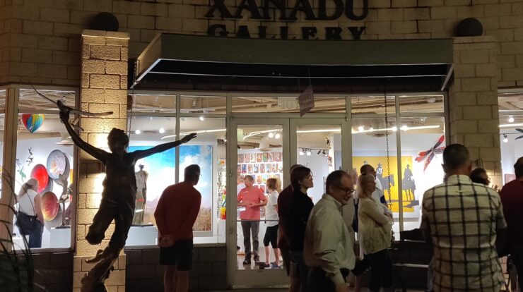
Most people walking past a gallery will decide whether to enter in just a few seconds. That means what they see through the front windows matters—a lot. I’ve spent time watching how people behave. Roughly 75% of visitors instinctively turn right when they come in the door, so that area gets extra attention. I use color, strong compositions, and popular pieces in the windows and near the entrance to draw them in.
But there’s a balance: you want the art to be clearly visible from outside, while also leaving enough space behind the glass to invite movement and discovery once someone steps inside. I leave a 5-foot buffer between the window and the first permanent wall to create breathing room and allow for visibility from multiple angles.
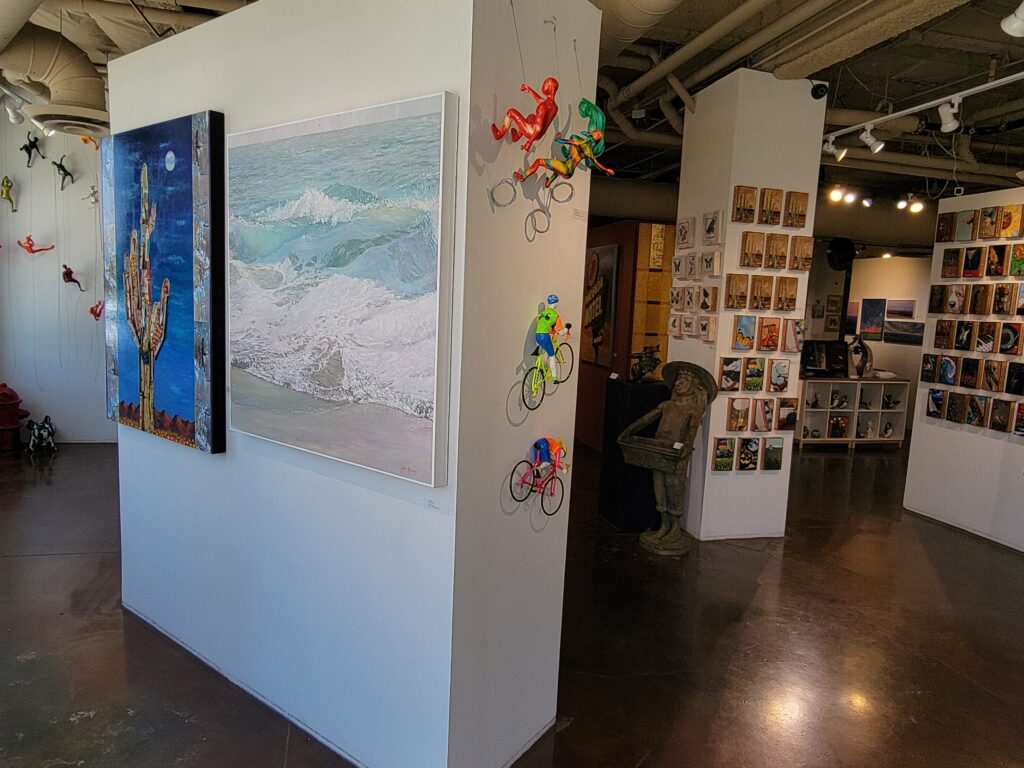
2. Creating a Journey, Not a Destination
Once someone is inside, the job isn’t done. The layout needs to keep them engaged and moving. I think of the gallery like a story—each section should invite the visitor to turn the page. That’s why our walls are positioned to create subtle pathways and corners that hint at what’s next. You shouldn’t be able to take in the entire gallery at a glance. There should always be something just out of sight, encouraging people to explore.
Time spent in the gallery directly correlates with sales. The longer visitors stay, the more likely they are to find something they connect with. The layout is designed to slow them down.
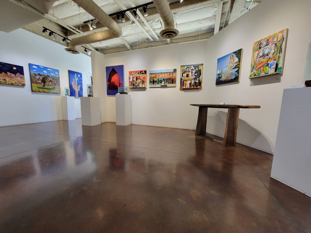
3. Designing for the Eye and the Wallet
While the artistic experience is important, this is also a business. The gallery must be a space where artwork sells. That tension—between aesthetic and commercial goals—drives many of my display decisions.
Some galleries lean into minimalism, showing just a few works in a large space to evoke a museum-like feel. I’ve experimented with that. It looks elegant, but in my experience, it doesn’t lead to more sales. On the other hand, overcrowding the walls dilutes the impact of the work. The sweet spot lies somewhere in between: enough work to provide variety and momentum, but not so much that the eye becomes overwhelmed.
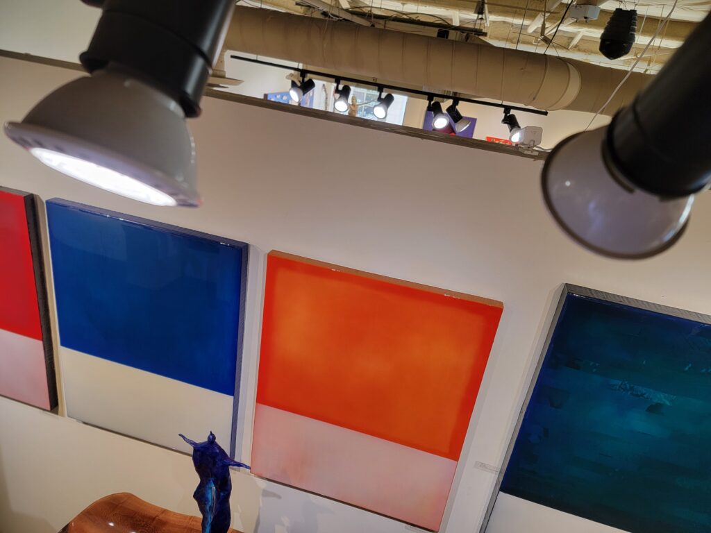
4. Lighting: Getting It Right Without Making It Obvious
Lighting is one of the most underrated elements in gallery design. We began with halogen lights, which offered great warmth and clarity but came with a constant need for replacement—and a hefty electricity bill. After a remodel, we transitioned to LED. They’re more efficient, longer lasting, and far less maintenance. The trick with LEDs is finding the right tone—some can be harsh or too cold. We tested several options before landing on a setup that maintained the warmth we needed without overpowering the artwork.
One major upside: I used to spend $2,000–$3,000 a year replacing bulbs. Since switching to LED, I haven’t changed a single bulb in over seven years.
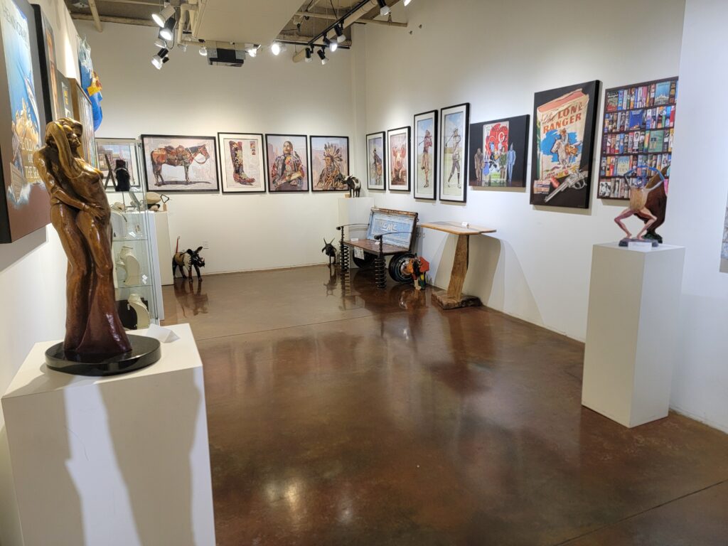
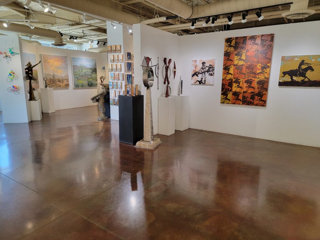
5. Zones: Organizing the Gallery for Flow and Focus
I divide the gallery into zones, each dedicated to a specific artist. That approach allows for a more immersive experience and helps viewers connect with an artist’s full body of work. It also gives each section of the gallery a distinct identity.
This strategy differs from some galleries that display work thematically or in a more haphazard fashion. There’s nothing wrong with those approaches, but I find that visitors engage more deeply when they can spend uninterrupted time with one artist’s voice before moving on to the next.
6. Encouraging Browsing—While Making the Buying Process Obvious
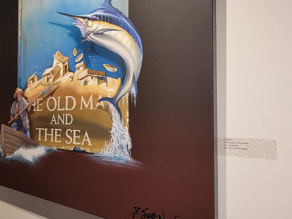
Art galleries can feel intimidating, especially to first-time buyers. Some visitors are hesitant to ask about prices or worry they’ll say the wrong thing. I want to eliminate that barrier. Every piece in the gallery is clearly labeled with artist name, title, size, and price. No mystery, no guesswork. If someone falls in love with a piece, they shouldn’t have to jump through hoops to learn whether they can own it.
At the same time, I make sure the environment is welcoming, whether someone is ready to purchase or just exploring. The space sends a clear message: this is a place where you can look, engage, and, if the art speaks to you, make it your own.
There’s no one-size-fits-all formula for gallery design, but every element should be intentional. You’re not just arranging art—you’re shaping an experience. A well-designed space invites visitors to stay, explore, connect, and buy. And when that happens, the gallery becomes more than a room with walls—it becomes a bridge between artist and collector.