
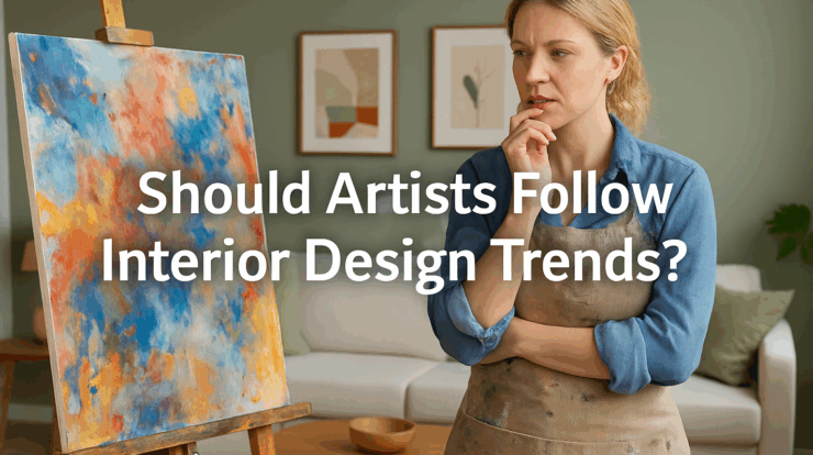
Every so often a color “of the year” sweeps across social feeds, showrooms, and design magazines. It’s tempting to steer your studio to match. After all, if buyers are asking for sage green walls and airy minimalism, shouldn’t your palette follow suit?
Short answer: be aware of trends, but don’t let them steer the ship. Your long-term career is built on distinctive, consistent work—not on chasing a moving target.
 The Problem with Small Samples
What feels like a “trend” is often a tiny slice of data:
-
Two recent buyers loved neutral palettes.
-
A designer asked whether you had softer pastels.
-
A slow month coincided with a bold color series.
Those observations are real, but they’re anecdotal. With small numbers, randomness looks like a pattern. Pivoting your whole body of work on small samples risks whiplash—confusing buyers, diluting your style, and slowing momentum.
Rule of thumb: when you think you see a pattern, ask, “How many data points do I have, over how many months, and in how many venues?” If the answer is “not many,” keep creating what you create.
Trends vs. Timeless
Interior design cycles move faster than fine art careers. A wall color can change in a weekend; a collector’s relationship with artwork lasts decades. Collectors buy the emotional experience of a piece, not a Pantone code.
Trends can inform presentation—framing choices, how you style a room shot, or which pieces you spotlight in a newsletter. They shouldn’t override your core visual language.
What to Watch (Without Overreacting)
-
Color waves: If a color family is everywhere, consider curating a few pieces that harmonize for promotional images. You’re not repainting your portfolio; you’re showing how your existing work lives in current spaces.
-
Scale and spacing: Open-plan rooms may favor larger works; tight urban homes may lean on diptychs or verticals. Adjust inventory mix—not your identity.
-
Subject matter emphasis: If your range includes both traditional and abstract, you might surface more of the side that aligns with what’s moving right now. You’re curating, not reinventing.
Build Feedback Loops (Real Ones)
Instead of guessing, set up lightweight ways to gather meaningful input:
-
Gallery partner reports: Ask for monthly notes on what’s getting tried on walls, what’s being held, and what closes.
-
Short collector surveys: A polite, 2–3 question email after a show can reveal why someone purchased (or didn’t).
-
Analytics with context: Track views and time-on-page for specific works, but correlate with in-person conversations and inquiries. Online behavior alone can mislead.
Look for converging signals over at least a quarter before declaring a trend relevant to you.
Protect Your Style with Guardrails
-
Consistency first: Keep your signature elements (mark-making, composition, finish) stable across series.
-
Experiment at the edges: Use small studies or a limited sub-series to explore a trend-informed palette or texture. If it resonates, fold aspects into your main line gradually.
-
Name the experiment: Label it as a distinct series so galleries and collectors understand where it fits.
A Simple Decision Framework
Before altering your work to match a design wave, check three boxes:
-
Fit: Does the change align with your authentic voice?
-
Signal strength: Do you have multiple, recent, cross-venue signals (not just a couple of comments)?
-
Sustainability: Can you reproduce the change consistently across new pieces without derailing production?
If any answer is “no,” adjust curation and presentation—not the artwork.
Smart Ways to Meet the Market (Without Shape-Shifting)
-
Photograph in context: Stage room shots that reflect current interiors so buyers can imagine your work at home—even if the palette is bold or unconventional.
-
Offer variety by selection, not reinvention: If you already create both quiet and vibrant pieces, modulate what you send to each venue based on their audience.
-
Use framing and finishes: Contemporary float frames, matting choices, or edge treatments can bridge different interiors while protecting the core of the piece.
The Bottom Line
Design trends can be useful signals, but they’re not steering commands. Track them, learn from them, and use them to curate how you present your work. Meanwhile, keep creating the art you’re passionate about—the work that carries your voice forward year after year. That’s what builds collector trust, gallery confidence, and a durable career.
Another thoughtful and knowledgeable analysis. Thanks!
The first gallery i became associated with [40 years ago] were quite good at reading the trends and would rapidly adapt the matting, framing and showroom presentations to accomodate these selling opportunities. The artworks were not adapted just the perceptions of them. A few years later the art would reappear for reframing to suit the clients changing view of themselves. Size changes dependent upon the prevailing building styles [ big houses/big art.. small houses smaller art] prevalent where the clients come from. Know a flower painter who can read interior designers and their clients like a book. paints the same style and forms just subtly adapting the color pallettes as one does for commissions. very successful and is a wonder to watch. the clients love it!!! compromises to trends are essentially 0.
As an artist with architectural design background. I preferred to work with interior designers and architects on commissions. On theses projects, it’s easier for me to change color palettes to suit their needs. My most recent commission was to create eight allegoric portraits for the JFKIAT4 in NY. The most challenging part of the assignment was adapting to their pastel color palettes. At the end of the day, four of the pieces was selected and now permanently installed at the airport. While it was a challenging task, I gained a different perspective and will benefit my practice moving forward.
Again, another article to center our thoughts. Thank you, Jason.
In another life when I was doing handweaving, it was suggested I follow “color forecasting”. I was producing one offs for a high end market that was dominated by commercial production in a niche accessories market driven my impulse. Color forecasting was a shiny object I learned. Automotive colors, by the way, are a big part of this. Those colors are planned about 4-5 years out.
So, as an artist, I will keep doing what I’m doing, letting my color palettes thrill me first, work in my preferred and dreamed about sizes, and let that be me. Maybe a bit of tweaking here and there within the range of an established consistency. Otherwise, it seems, if we see a trend start to crop up, it’s already on its way out.
I’ll start by saying, I’m not a landscape Artist. That being said, people’s first reaction to my work is often about the color(s). Blue being the most popular. Mauve, magentas and even pink tones come in second…and lately, variations of black and white. Then there is taupe. Perhaps I’m not a purest, I like selling. Unfortunately, I find if a work doesn’t go with the sofa, it’s much harder to sell.
Sorry for the cynicism…just saying.
Nice piece — clear and practical. Quick question: when you recommend running small studies or sub-series to test a trend, how many pieces and what timeframe would you suggest before deciding whether to fold elements into the main line? Also, have you seen any simple survey questions that reliably reveal why collectors choose a work?
Thanks for the thoughtful insight! Over the years, I’ve learned to ask every buyer to send a photo of my work on their walls. Yup, most have bought because my painting looks good over their couch or coordinates with their wall color, and they have an emotional response to the place I’ve painted. Summary – I stick to my signature style but incorporate new color palettes to stay up with current trends.